 When designing your website you want to carefully choose colors that correspond with the message (your niche) that you are trying to get across to your visitors.
It is extremely important to choose colors that invoke the emotion or feelings that you want your visitors to experience.
You need colors on your website that sit comfortably with the client you are trying to attract.
You certainly don’t want to design a website to attract contractors like electricians or plumbers and make it all pink. Most men probably wouldn’t even read it if it’s all “pinked out.”
The right colors on your website can actually convert prospects into clients.
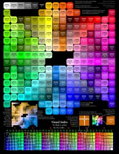
Let’s take a basic look at what colors invoke what type of emotion or feelings in your visitors. The way this works all boils down to human psychology. It is all about human perception and how we visualize things.
Most of the common colors and the perception of each color are listed below:
BROWN – Brown is a color that represents nature. This color would be good if the clients you were trying to attract were nature-related like gardeners or environmentalists.
WHITE – White is a color that symbolizes purity, innocence and possibly cleanliness. This would be a attractive color if you wanted to work for churches, wedding planners and even baby product sites.
PINK – Pink is a color that is associated with femininity. This color is often seen on client websites with baby information, women’s health information or maybe websites for young girls.
GREEN – Green is a calming color. It represents things such as nature, money, health and life. It is not uncommon to see green on websites that have to do with gardening, money or nature. Great color if you are trying to attract eco-friendly type clients.
PURPLE – Purple is a color that is associated with passion, luxury or fantasy. Client websites that surround love, passion, romance or even astrology will proudly display purple. Clients like hypnotists and psychics are attracted to this color.
ORANGE – Orange is a color that is associated with things such as sports, celebrations or fun activities. Many sports websites have orange as a primary color. It’s also prominent on websites that sell party supplies or websites for kids.
RED – Red is a color that makes a person think of love, romance, danger, adventure or maybe excitement. It’s also a great way to get the attention of your visitors if you are putting on a sale. If you are trying to attract clients who have that passionate side to them like a romance author this would be a good choice.
YELLOW – Yellow can have a calming effect some people and is often used for training/educational websites. If you are marketing to clients like life coaches providing educational materials, this would be a good color choice to attract them.
BLACK – Black is just kind of drab. It’s not really a color you would want to use if you are trying to sell your services. Of course, it’s often used as a font color since it is a very readable color. Unless you work for magicians or only during the haunted Halloween season, it’s probably better to refrain from using too much black.
BLUE – Blue represents cleanliness, crispness, and freshness. It has also been said that blue represents purity. A very business-like, color for a virtual office and you’ll find many Virtual Assistants use this color to attract larger corporate clients.
When choosing the colors for your website design make sure you choose the colors that support the target market you are trying to reach. Colors that ground your visitor and make them feel right at home upon clicking to your site. If you use a bit of human psychology and choose the right colors for your website, your target market will subconsciously trust you which is the first key to enticing them as your next new client!