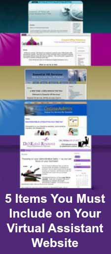
 Why is a website essential for a VA?
There is no question that having a website is the most important ingredient in a Virtual Assistant’s online marketing strategy. Your website is the online face of your Virtual Assistant business; it is where people get to see your brand, view your offerings, read about your company, view your privacy policy or business protocols, look at your picture and read about you. It is your STORE FRONT!
Does a Virtual Assistant have to have a website?
YES! These days, what Virtual Assistant doesn’t? We are virtual aren’t we? Your goal is to get your potential clients into your marketing funnel so that you can market to them over and over again, so it is important to have a website that conveys professionalism, security, and trust.
Getting Started
Remember that your website is a living document and will undergo many changes. So keep it simple when you’re starting out and avoid investing a lot of time and money into the latest technology that may be difficult to revise or update. Don’t think “state of the art”; think, “state of the market.”
You want a professional, error-free site that is easy to navigate and you can accomplish that simply and inexpensively.
I highly recommend a WordPress.org website like the ones we build for Virtual Assistants at my network. Check our website sample packages out by clicking here.
Now, you may struggle with deciding the best content, colors and font size. The easiest way around this is to step back and design your site from the standpoint of what your clients would like to see. Would your clients want to know which programs you are familiar with? Would they want package deals or a la carte services? Looking at your website from the perspective of your clientele, you can never go wrong.
5 things you must include on your website
- Your contact information. It’s essential to provide a way for your clients and potential clients to contact you, and it also shows that you are a legitimate business. A phone number easily visible on every page is an excellent CALL TO ACTION! An “About You” page with your picture will also create a sense of trust to your potential prospects.
- Privacy policy. People are feeling insecure about the Internet, because of cases of identity theft and unscrupulous marketers who sell private information and don’t provide a secure environment for online transactions. Your visitors need to be reassured that they’re safe at your website and in doing business with you.
- Your rates and/or prices. If you’re selling products, by all means list your prices. If you’re providing a service, you may choose to wait until you’ve had a chance to meet with a potential client and tell them more about the value you can offer. However, I must say that it’s my personal preference to see the costs of a service professional up front, before I choose to make contact so I recommend putting your retainer packages online for your prospects to see. (It also weeds out the clients who are just looking for cheaper options).
- An Opt-in on EVERY page. Every page of your website is a potential entry point for a new client to sign-up to your newsletter, e-course or special report and not just your home page. The money is in the list! Remember that a website visitor may click away and never come back, and you’ll have lost your chance to help them. So get them on your mailing list and keep in touch with them regularly.
- The most current information. Nothing looks more unprofessional than outdated content and broken links. Keep the content fresh! Your customers and clients will thank you and the search engines love updated content.


Great ideas!
I hadn’t thought about a Privacy Policy, I’m going to work on mine this weekend and get it on the site.
I have a retainer package designed but didn’t have it on the website, I’m going to think about this, so far everyone who has contacted me just wants to know the hourly rate…
Viki
Thanks for the timely article. I’ve got a new website and can use all the tips I can get.